@VonSzarvas I see you've copied the bit that sets the Parallax font on the code blocks. That's really cool, but to make it display that font on machines without PropTool installed (currently it falls back to default monospace, which isn't bad, either), you have to put this definition into the CSS and the attached WOFF file (unzip first..) into the same directory as the CSS file
I didn't see Preview or Quote buttons, because I had switched to Google Chrome & Firefox without re-signing in... why is the emoji above on a separate line?
With this markdown editor, the old images plugin appears to work.
Seems this could be the way to go.
I've not tried it on a mobile yet, but I can upload new images here ok.
Will be off air for a few hours, and will work over any more feedback in the morning. Seems there's some theme tweaks, including alignment and a possible font size control.
Thanks to @whicker too... The narrow blue splodge was resolved, and the nav question is on the list! And cheers for the Woff @Wuerfel_21 -will be added!
I personally do not like everything that was done to this forum page but if the topic main page was done in a way where you just pick the form that you want to look at with out having to scroll through all of post would be a lot better in my opinion but one thing
I do like about the message screen is that it is double spaced line wise it is easier for to read and type my comments on a tablet this I do like a lot
Also, there's some weird issue where stuff sometimes shows up on top of the header bar. Setting this fixes it, but IDK if that's the right way to fix it?
/**
* @brief And code blocks
*
*/
namespace PropWare {
class Uart {
public:
template<size_t N>
virtual int send (const char (&bytes)[N]) const = 0;
}
}
The excess whitespace between each line in the editor is pretty annoying.
Shift+enter doesn't seem to help that any.
And apparently we can't manually set a language within a Markdown block... that's surprising. Usually Markdown supports three backticks followed by a file type, such as "c++" or "py" to set the language explicitly instead of relying on highlight.js's ability to figure it out automagically.
I'm most missing the "Mark all read" button. Any chance of that coming back?
Ditto on what others have said about there being very little to distinguish "read" threads from unread ones.
Just noticed that prior code windows no longer have a scroll bar. Long programs use up however much vertical space the program requires. Please restore the scroll bar. (And why does my edit window double space?)
From a usability standpoint, the stuff in the righthand column, except for Search should go back to the left side where it used to be. The Categories list should be proximal to where we are now, e.g. HOME->GENERAL DISCUSSION [thread title], which is on the left. IOW, "This is where we are now. Look a little to the left, and click to go somewhere else," instead of having to scan clear across the page. This looks like it was change for change's sake without considering the consequences.
@VonSzarvas - if you are on top of it rather than over it, then I'm sure you "welcome the feedback" There's plenty of it.
I know we always want a "better" forum but I don't understand the decisions that are made and why sometimes. I'm sure if we understood the reasons why changes were made and what decisions there were and why, then I'm sure we'd all be happier. It is definitely better on the phone and with my dark theme although I always have to scroll past the about this and stickys to see what's new. If all this work is to make it better on a phone then is there any reason they need to be at the top or could they be at bottom or accessed via just the one link or button?
Just my 2cents.
large images will overwrite the 'header' (same for chrome/edge & firefox under windows)
Under Linux it does something similar, but seems to include a bigger portion of the message surrounding the image (which will show transparently
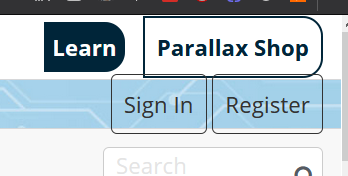
On firefox the sign in buttons are too large (windows, OK under Linux. OK for chrome/edge)
Can we pleaaaaaaase get an edit preview in the Home › Inbox editor too?
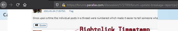
...and the "Post 79" @ top right is coloured like a link but isn't one. That's confusing. Can it get the same address attached as the timestamp or if staying not a link, then get a different colour ?
Editing a post doesn't give a preview too... :-/
Maximised editor view doesn't have "Cancel/Save" buttons intentionally?
The line spacing looks extreme in the editor. Is that a local problem for me?
I'll third the request for a return of the Mark All Viewed link. It was a critical tool for my daily perusal of the forum. I don't need to be told that there are 107 new posts in a thread I'm not interested in and will never click on.
Line spacing, font and font size is now fine on my iPad (cheaper standard iPad).
Cannot see the difference between read and unread threads. Are these still working?
@"Phil Pilgrim (PhiPi)" if you right click your avatar image in the far upper right (next to the star), it has a menu and one option is to mark all viewed.
While you are doing all this forum work, can you please change things so that links open in new tabs instead of replacing the forums tab? So tired of clicking a link and then having to immediately go back to get the forums back then right click the link and choose open in new tab. This has been an annoyance here for years.
Not a breakage but... do you like the categories panel on the right ? The page seems a bit too "asymmetrical", can you move the categories column (with new discussion and the bottom rolling image) to the left as before ? Seems more elegant.
Speaking of the rolling image: what it is for ? Now I see the P1/P2 hub ram interface schemes... it is some sort of "highlight" placeholder for annoucements ?
@"Roy Eltham" said:
While you are doing all this forum work, can you please change things so that links open in new tabs instead of replacing the forums tab? So tired of clicking a link and then having to immediately go back to get the forums back then right click the link and choose open in new tab. This has been an annoyance here for years.
Just hold CTRL while clicking on the link. Opens a new tab. It’s a browser function.
I always ctrl click to open a link in a new tab.
The line spacing on posting is way wide but - non-sequitur - I don't mind the columns on the right side since I have vertical tabs open on the left (I always have way too many tabs and windows)
emojis seem to have a social distancing thing though.
Overall I like the new layout pretty much. Yes, there are a few things to be ironed out, and I guess many of them will be resolved, rest we'll learn to live with, just like before
large images will overwrite the 'header' (same for chrome/edge & firefox under windows)
Under Linux it does something similar, but seems to include a bigger portion of the message surrounding the image (which will show transparently


Comments
Just viewed on mobile. I do not see much contrast between already visited discussions and updated or new ones.
Inline code
shouldwork insidesingle ticks@VonSzarvas I see you've copied the bit that sets the Parallax font on the code blocks. That's really cool, but to make it display that font on machines without PropTool installed (currently it falls back to default monospace, which isn't bad, either), you have to put this definition into the CSS and the attached WOFF file (unzip first..) into the same directory as the CSS file
@font-face { font-family: 'Parallax'; src: local('Parallax'), url('Parallax.woff') format('woff'); font-weight: normal; font-style: normal; font-display: swap; }I didn't see Preview or Quote buttons, because I had switched to Google Chrome & Firefox without re-signing in... why is the emoji above on a separate line?
Markdown is good, mostly...
PUB main | x, y repeat x += ysingletick is inline... Got it!Is: https://us.forums.blizzard.com/en/overwatch/t/forum-markdown-guide/80252 a decent style guide for Markdown?
a test (there are missing lines compared to the Markdown example page):
test Markdown Reference syntax:
Markdown is a lightweight markup language. It is designed so that it can be converted to HTML.
Oh, back to plain editor.
Spin diagram in code block test:
With this markdown editor, the old images plugin appears to work.
Seems this could be the way to go.
I've not tried it on a mobile yet, but I can upload new images here ok.
Will be off air for a few hours, and will work over any more feedback in the morning. Seems there's some theme tweaks, including alignment and a possible font size control.
Thanks to @whicker too... The narrow blue splodge was resolved, and the nav question is on the list! And cheers for the Woff @Wuerfel_21 -will be added!
I personally do not like everything that was done to this forum page but if the topic main page was done in a way where you just pick the form that you want to look at with out having to scroll through all of post would be a lot better in my opinion but one thing
I do like about the message screen is that it is double spaced line wise it is easier for to read and type my comments on a tablet this I do like a lot
RE: tables
Yep, tables are broken. I messed around a bit and this makes them look nice:
th,td {
    border: 1px;
    border-style: solid solid none none;
    border-color: #555;
}
tr:nth-child(even) {
    background-color: rgba(140, 181, 200, .15)
}
table {
    border: 1px;
    border-style: none none solid solid ;
    border-color: #555;
}
thead,tfoot {
    background-color: rgba(140, 181, 200, .45)
}
table test:
Also, there's some weird issue where stuff sometimes shows up on top of the header bar. Setting this fixes it, but IDK if that's the right way to fix it?
.Header-vanilla { z-index: 150; }So... we have
Markdownnow, eh?/** * @brief And code blocks * */ namespace PropWare { class Uart { public: template<size_t N> virtual int send (const char (&bytes)[N]) const = 0; } }The excess whitespace between each line in the editor is pretty annoying.
Shift+enter doesn't seem to help that any.
And apparently we can't manually set a language within a Markdown block... that's surprising. Usually Markdown supports three backticks followed by a file type, such as "c++" or "py" to set the language explicitly instead of relying on highlight.js's ability to figure it out automagically.
I'm most missing the "Mark all read" button. Any chance of that coming back?
Ditto on what others have said about there being very little to distinguish "read" threads from unread ones.
I'm having trouble finding the "Mark All Topics Read" control -- did that disappear?
Use the little gear next to every major forum topic header.
Just noticed that prior code windows no longer have a scroll bar. Long programs use up however much vertical space the program requires. Please restore the scroll bar. (And why does my edit window double space?)
-Phil
From a usability standpoint, the stuff in the righthand column, except for Search should go back to the left side where it used to be. The Categories list should be proximal to where we are now, e.g. HOME->GENERAL DISCUSSION [thread title], which is on the left. IOW, "This is where we are now. Look a little to the left, and click to go somewhere else," instead of having to scan clear across the page. This looks like it was change for change's sake without considering the consequences.
-Phil
@VonSzarvas - if you are on top of it rather than over it, then I'm sure you "welcome the feedback"") There's plenty of it.
There's plenty of it.
I know we always want a "better" forum but I don't understand the decisions that are made and why sometimes. I'm sure if we understood the reasons why changes were made and what decisions there were and why, then I'm sure we'd all be happier. It is definitely better on the phone and with my dark theme although I always have to scroll past the about this and stickys to see what's new. If all this work is to make it better on a phone then is there any reason they need to be at the top or could they be at bottom or accessed via just the one link or button?
Just my 2cents.
Some more items:
large images will overwrite the 'header' (same for chrome/edge & firefox under windows)
Under Linux it does something similar, but seems to include a bigger portion of the message surrounding the image (which will show transparently
On firefox the sign in buttons are too large (windows, OK under Linux. OK for chrome/edge)
Can we pleaaaaaaase get an edit preview in the
Home › Inboxeditor too?...and the "Post 79" @ top right is coloured like a link but isn't one. That's confusing. Can it get the same address attached as the timestamp or if staying not a link, then get a different colour ?
Editing a post doesn't give a preview too... :-/
Maximised editor view doesn't have "Cancel/Save" buttons intentionally?
The line spacing looks extreme in the editor. Is that a local problem for me?
I'll third the request for a return of the Mark All Viewed link. It was a critical tool for my daily perusal of the forum. I don't need to be told that there are 107 new posts in a thread I'm not interested in and will never click on.
-Phil
Line spacing, font and font size is now fine on my iPad (cheaper standard iPad).
Cannot see the difference between read and unread threads. Are these still working?
@"Phil Pilgrim (PhiPi)" if you right click your avatar image in the far upper right (next to the star), it has a menu and one option is to mark all viewed.
While you are doing all this forum work, can you please change things so that links open in new tabs instead of replacing the forums tab? So tired of clicking a link and then having to immediately go back to get the forums back then right click the link and choose open in new tab. This has been an annoyance here for years.
Not a breakage but... do you like the categories panel on the right ? The page seems a bit too "asymmetrical", can you move the categories column (with new discussion and the bottom rolling image) to the left as before ? Seems more elegant.
Speaking of the rolling image: what it is for ? Now I see the P1/P2 hub ram interface schemes... it is some sort of "highlight" placeholder for annoucements ?
Just hold CTRL while clicking on the link. Opens a new tab. It’s a browser function.
Sure, but every other site I go to opens links in new tabs by default, why can't we?
What other sites? Not in my experience.
You can also middle-click a link to the same effect
I always ctrl click to open a link in a new tab.")
The line spacing on posting is way wide but - non-sequitur - I don't mind the columns on the right side since I have vertical tabs open on the left (I always have way too many tabs and windows)
emojis seem to have a social distancing thing though.
Overall I like the new layout pretty much. Yes, there are a few things to be ironed out, and I guess many of them will be resolved, rest we'll learn to live with, just like before
making the editor's line height same as the posts would be
textarea { line-height: 1.3; }This is exactly what I (vaguely) mentioned above.