

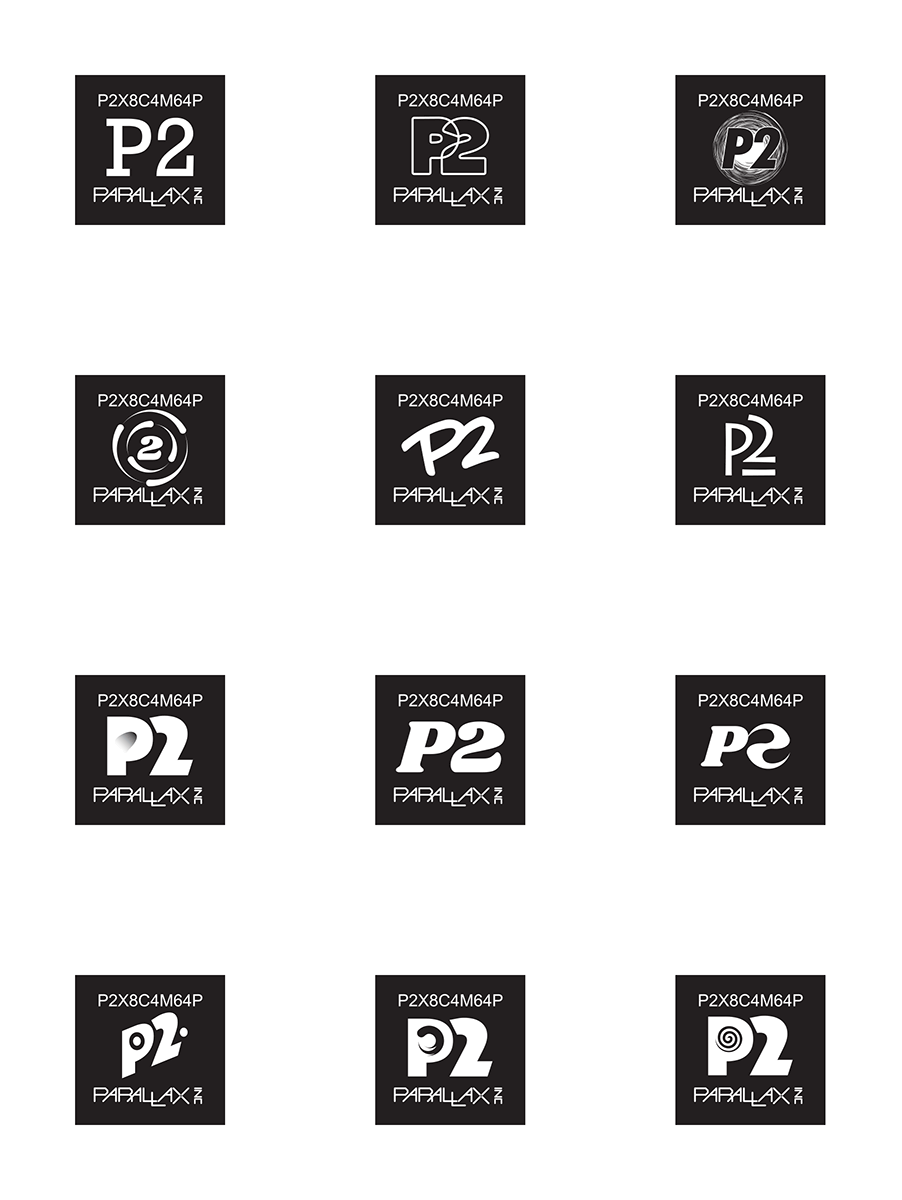
Possible P2 Logos
 cgracey
Posts: 14,297
cgracey
Posts: 14,297
Our graphics designer came up with some P2 logo ideas.
Currently, we are using a bold Eurostile font.
What do you all think of these new variations?
Currently, we are using a bold Eurostile font.
What do you all think of these new variations?
Comments
clean, modern, and simple to reproduce for most any application.
Nothing there really belongs on an Embedded Microcontroller.
The P2 itself does not signal much at all to the new reader, P2X may be better as a 'family name'
Google may direct someone to this : https://en.wikipedia.org/wiki/Intel_P2
John Abshier
If there are concerns from a trademark perspective then I'd lean toward Row 1 Column 3, or a variant of Row 2 Column 1 that had eight orbiting blobs to better reflect a distinctive feature of the chip.
If the impetus is simply to go for something "stylish" or "interesting" I'd say no need for change from the current logo.
Regarding where Google may direct someone with a search:
It didn't stop Blackview or Lenovo from naming processors P2.
One of the original logos i did had the P2 italicized with 4 stripes on either side to correspond to 8 cores. It was rejected as being "too gimmicky" by some but to me it looks a lot better than these latest toy offerings.
J
or this one where I have converted the P2 and stripes to a metafile and stretched them etc.
You must use Tide!
My first impression of that one was "washing powder" and I guess Tide sounds like a brand (not that I would know).
Slogan: "P2 turns the tide of the core wars with its eight powerful 32-bit guns trained on the target and a phalanx array of 64 rapid fire ports."
decoding what columns row people referring to is to much work.
Or maybe tweak those 8 lines more like '8 cores' - square them up, roughly as below ?
LOL, it does bear a resemblance! Maybe it's the 90's raver kid in me that likes it. That imagery was used in all of the flyers, streetwear, etc.
edit
I think in the last years stuff got 'hyped' way to much to satisfy a need not there.
Why make a swirly logo to impress people who never buy the chip? Does anybody here buys chips because the look - hmm - cool?
Instead of looking for nice logos it would be better to get toolchains running, SPIN2 finalized and Openspin/gcc/clang/blockly/Propbasic adapted for real user work on the P2.
Douglas Addams wrote something along the line that there was a problem re-inventing the wheel, because the involved people could not agree about the COLOR of the wheel.
sorry, but logos are the most less important things right now.
/edit
Mike
If we don't need to worry about part numbers and just concentrate on "P2" as a stand-alone logo then that changes everything. But trying to incorporate that logo as part of the chip markings may not look as good.
If Parallax really want the chip markings to stand-out on their boards they can always attach a nice shiny color label for that purpose, and perhaps make these labels available for a price for anyone else who wants to feature the logo. For OEMs who bury the chip inside a box it doesn't matter plus they can always attach a "P2 inside" sticker.
Agreed. Our graphic artist thought she'd try some new ideas, so I posted them here to get some responses. Personally, I'm not too passionate about changing from what we've got (which isn't much, but is fine).
I think you agree too easily Chip. Those who are busy on tools will be busy on them for sure and others will have time on their hands, but in regards to the matter of a logo I think this is important for Parallax. Before anyone knows anything about a chip about the only thing that will catch their eye is a "catchy" logo.
When I design a pcb I may include extras that may or may not be loaded and there is no difference in cost. So if it costs nothing, yet might be valuable, include it, you have nothing to lose and a lot to gain. Same goes for the logo. I find it hard to believe that a tool developer will not stop to eat or sleep or breath. There are other far less important personal things as well. Input on a logo is barely even worth mentioning in relation to those things.
So why put a cap on it, just let the logo horse have its head and see where it leads us.
You know the propeller from a beanie hat could fit in there too. It’s long but thin... would add a hint of P1 fun...
To do a logo right, there needs to be some statements that position the product and that can drive, support the art.
Here are a few I thought of:
The engine in engineering.
[Made, designed, created] different for a reason.
Silicon with smarts.
Microcontroller beast edition.
...you all get the idea.
Now, I pretty much hate those, but put them here to stimulate discussion.
What phrases, words pop into your head when you think about this thing?
If we do this, or someone, somewhere does this, we will see relevant art. If not, we will see catchy art.
That, brutally, is how this works.
What say you?
(Had sketch pad out, drawing things, none of which seem sharable yet.)