QROTATE and QVECTOR made simple
Finally sat down and experimented with these two cordic ops. Once I got my head around them, they made perfect sense.
Because they accept and produce fixed-point numbers (integers) rather than floating point numbers, they can't scale from mega to micro. This limits the ability to calculate a tangent for example. So the issue is avoided by producing a dual component output. But the trigonometry is still the same and still straight forward once you know what each input and output component represents.
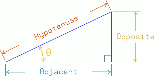
Listing the components of the right-angle triangle:
- Right-angle - The obvious - The corner that is 90°
- Hypotenuse - The long sloped side
- Theta, θ - The angle of the chosen corner (not the 90° right-angle)
- Adjacent - The side adjacent to Theta (that isn't Hypotenuse)
- Opposite - The side opposite Theta

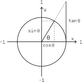
And Sine, Cosine, Tangent are all derived from those.


Comments
The cordic ops themselves ... It's amazingly simple:
        qrotate  hypotenuse, theta
        getqx    adjacent
        getqy    opposite
qvector adjacent, opposite getqx hypotenuse getqy thetaThe lengths of hypotenuse, opposite and adjacent defines the triangle size. Just like it would physically. However, in practise it is desirable to stay large so as to maximise resolution of the calculation.
Theta angular scale is fixed at the circle equating to 32-bit, ie: 232 for a full 360°
SOHCAHTOA solves the rest:
Sin(θ) = Opposite / Hypotenuse
Cos(θ) = Adjacent / Hypotenuse
Tan(θ) = Opposite / Adjacent
Not that any of those are usually wanted directly but it's good for proof.
It's the sides of the triangle that are the end uses. The cordic does the job better by skipping the Sine/Cosine steps.
Thank you Evan - that helps me understand the Cordic, etc., much more clearly.
+1
thank you
Mike
I guess there probably is situations where you know you have the length of the hypotenuse, and another side. And you want the third side but don't have an angle for theta.
It's long-winded to work with a sine or cosine as fixed-point. So another approach is Pythagoras Theorem: A2 + B2 = C2 Where C is the hypotenuse. Therefore: A = sqr(C2 - B2)
We have cordic 64-bit tools to preserve full 32-bit resolution:
pri  pythagoras( c, b ) : a
    org
        qmul    b, b
        qmul    c, c
        getqx   b
        getqy   a
        getqx   c
        sub     c, b    wc
        getqy   b
        subx    b, a
        qsqrt   c, b
        getqx   a
    end
EDIT: Corrected the operand order of the QSQRT from b,c to c,b as per Tony's fix.
UPDATE: Add the interrupt safe version:
pri pythagoras( c, b ) : a org rep @.rend1, #1 ' IRQ shielding qmul b, b qmul c, c getqx b getqy a getqx c sub c, b wc .rend1 ' next instruction also shielded getqy b subx b, a rep @.rend2, #1 ' IRQ shielding qsqrt c, b getqx a .rend2 ' next instruction also shielded endGreat post! Thank you. Seeing the terms defined and then used in a code context is a big help. Super clear to me.
The best thing about your post may be people expecting more being less confused by seeing how little is needed right away.
Post of this nature, complete with the context and code examples, are absolute gold to me. Not everyone here writes code for a living or has a comp sci background, so stuff like this really flattens the learning curve!
For the opening post, I pillaged the trig images from other websites. A quick google to find something suitable.
It worked. Do you want / need original art? I can redo those...
I'm easy. Parallax might care.
Here's the main one - https://www.mathsisfun.com/algebra/trigonometry.html
The second one came from Wikipedia - https://en.wikipedia.org/wiki/Trigonometry
Why not make some nice animated ones with the DEBUG PLOT window?
I haven't been doing any plotting. I'd be wanting a debug server with plotting that is not an IDE.
My use of debug was only as text reporting. And because of debug()s baud adjusting limitation I've stopped using it for that too.
Here's that art, along with an SVG for colors, whatever.
+1 for Parallax font ;p
Always!
An animated one would be good too. One day, we can make type in examples, have a P2 execute code people put in, like virtual machine style, and they can interact with this stuff, see the changes. It's why Chip put all the goodies in there.
I did the quick art for docs purposes. It's all free for any use, no worries.
Thanks Doug. Nice to have something to work with when unfamiliar with tools - Inkscape in this case. I've replaced the slashed-ohs (used for diameter) with Thetas.
Oddly the font size didn't match. I think I managed to use the Parallax font but to get theta to look okay size wise I had reduce from 40 point down to 24 point in the diagrams, and from 24 point down to 18 point for the theta beside each sin/cos/tan.
EDIT: Updated with colour.
EDIT2: Opening post now uses exported PNGs of this so then the web-server doesn't have to convert.
Comments added and error corrected.
pri pythagoras( c, b ) : a 'a = sqrt(c*c - b*b); destroys b,c org qmul b, b 'start CORDIC b*b qmul c, c 'start CORDIC c*c getqx b 'b = b*b [31:0] getqy a 'a = b*b [63:32] getqx c 'c = c*c [31:0] sub c, b wc 'c = c*c - b*b [31:0] write carry getqy b 'b = c*c [63:32] subx b, a 'b = c*c - b*b [63:32] - carry, {b,c} = a*a qsqrt c, b 'start CORDIC sqrt{b,c} getqx a 'a = sqrt(c*c - b*b) endHuh, S:D seems backwards compared to everything else. But you're right, reading the docs does say it that way. Shows I never tested the code.
Amusing, cos I favour S,D syntax order in assembly.
D'oh!
I grabbed the wrong glyph! That is what the SVG was for apparently.
Looks great! Should I edit lines in the other one for colors?
Edit: And the right angle!
Good you popped it in. The line weights are in stroke style. That is a side panel on the right that should appear when you pick a curve entity, should you want to change any.
Sure. Graphic art ain't me favourite pastime.
Yeah, I tweaked those up when shrinking the second diagram. Doesn't affect the font thickness though.
Another thing I discovered is the fonts are fills only, while the lines are strokes only. If I selected-all and adjusted stroke then all the fonts suddenly got much thicker because the stroke outline on them suddenly appeared.
Yeah, it is all kind of a jumble. I have some minor league skill due to business and AD related work. Whole different mindset compared to technical software. Still Inkscape is a good tool. Like Blender, it takes a little investment.
I can do another clean up pass now that the direction is clear. Figure totally free docs help everyone. And I like the colors.
As far as shrinking goes, I tend to avoid it. Usually I create at a size and line weight that gets along with whatever voodoo a particular font presents. Then output high DPI bitmaps and call it a day. Or, the right DPI bitmap, if somehow it has to drop in somewhere. The net of it is having a few source art docs in Inkscape, then the target docs have image assets. Easier.
Specifically, I will drop the text onto a page, in the target font, draw a little, clean that up to set style and then work through from there.
Here it is with line segments for colors.
Heh, I'm having second thoughts now. Went to apply your coloured Sine/Cosine/Tangent drawing and suddenly felt it conflicted with the right-angle triangle colours. I'm inclined to leave it black and white now. Apologies.
LMAO! No worries. That is often how these things go.