

Propeller TrueType font unreadable
 Surac
Posts: 176
Surac
Posts: 176
People working with the PropTools IDE already know the Parallax.ttf font used to render all the source code in this application. However, using the font outside of PropTools gives very mixed results. Using the font has some nice benefits, as it contains some basic schematic symbols useful for documenting hardware/software projects. The symbols are not part of the UNICODE range of symbols and so are unique to this font.
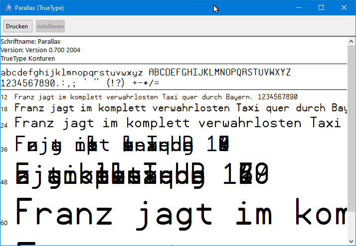
shows the problem quite clearly: Some font sizes work, but others don't. I have seen this Problem
for many years now. Today i grabbed a Program FontForge wich i used some time ago in projects to create my own fonts. FontForge was able to load the Parallax.ttf file and quickly showed me the problem
- Some glyphs violate font rules that strokes must not cross other strokes. This is not the showstopper
- Some glyphs violate winding rules for fonts, also no showstopper
- The font "says" it contains many Bitmap representations of the symbols, but the bitmaps are empty. Only some font sizes contain bitmaps. That's the killer
As TrueType fonts normally are vector fonts one may ask why bitmaps? Because sometimes rendering the vectors give bad results while using low font sizes. Most nice-looking fonts
contain careful handcrafted bitmaps for problematic symbols. Windows then uses the bitmaps while rendering this symbol. If a font declares having symbols but the bitmaps are missing or empty the font rendering gives results like seen in the above picture
Using FontForge i just deleted ALL bitmaps inside the font, changed the name to Parallax2.ttf and exported it again.
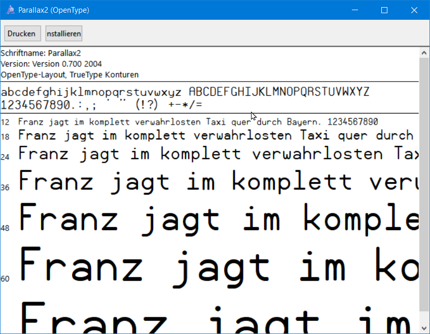
This file is now small and renders well in any size, however it contains no bitmap symbols. I know this may give some bad results with low font sizes, but i wanted to make clear what the problem was.
I include the Parallax2.ttf here

Comments
Thanks @Surac.
Someone reported a while ago that removing the bitmaps from the font "solved" the problem, but since small sizes would render poorly, it wasn't a solution we could use. You're the first one I've seen report that it says it has bitmaps where none exist (glyphs are empty), and the other problems you reported too. Thank you! All this time I was looking in the wrong place for the source of the problem as it remained mysterious to me.
I've used the Parallax font in Notepad, Wordpad, and MS Word (and other places) and don't recall having this trouble with it after release (other than when it wasn't installed properly). Maybe I never tried the problematic font sizes?
Can you give me an example of software and point size where you see the problem occur?
Follow-up: I had to dig up some memories about why we had to add bitmaps and what the interactions were with software, hardware, and OSes at the time.
It all boils down to proper (or near-proper) rendering of the intent of each glyph at various point sizes, which is mostly at problem at smaller sizes but is still a problem as some larger sizes too, and may be problems only with certain glyphs and not others at any given point size.
When we developed this, many Windows versions in use didn't render using the ClearType engine yet, or had ClearType capability but defaulted to "off." This made bitmaps for the smallest font sizes very critical for the best appearance. Fast forward to the present: at this point, ClearType (and it's replacement) is the norm, is "on" by default, and Win10 kind of hides the setting for it so it's less likely to be turned off, so it seems like removing all the bitmaps is the best thing to do going forward.
Still, the glyph hinting rules (that were designed to improve the ClearType-renders) for the font don't function as perfectly as I wanted. It'd be nice to fix all that.
I don't know why some strokes cross other strokes (will have to look into that) and don't know what "winding rules" are. Perhaps FontForge will work better than the Fontographer system we used years ago when we developed it.
Thanks for all the tips!
No, don't remove the bitmaps!!! Unless a font is really, really well hinted, vectorizing it at small sizes will always look somewhat terrible. Either blurry or an indistinguishable mess of pixels.
Yes, you are 100% right. It was not me intend to remove the bitmaps. Only thing i was pointing out that removing the bitmaps 'cured' most of the problems. If there will be another way to fix it easy without investing many hours i will gladly go that way
@"Jeff Martin"
Using notepad++ and the Windows10 Notepad i tried the font in varied sizes. Here is a table and small picture of a 'bad' size
5-6-7-8-9-10-11 == OK
12-14 == bad
16 ==OK
18 == bad
20 == OK
22 == OK
24-26-28 == bad
Can you just try opening the file in font forge and saving it back out without changing anything? That might be what actually fixes it. I don't think the glyphs all stacking on top of eachother has to do with the bitmaps at all, because the problem also happens at really large sizes that I don't think are bitmapped at all.
Do you have DPI scaling set to something other than 100%? Because the bad sizes are different for me and sortof looks like it. Then again, I am using Windows 7 and have messed a lot with the font settings (was even using a program to replace GDI text rendering with freetype at some point, but had to disable it because it was causing problems)
That would make sense to me too because it seems to be an error in the file that's causing kerning problems between characters. I believe the problem began sometime after a long series of bitmap creations and edits (something I didn't notice until way too late to track it down) but I remember having strange problems that began after a certain point in the design process and figured they were bugs in Fontographer, though could never find the exact cause nor prove my theory.
yes, using 125% scaling provided by windows
I already tried to just let Fontforge recreate the file. Unfortunately it didn’t did the trick.
Tomorrow I will try to only delete the not working sizes as they seem to be empty anyway.
This tread was not meant to start a war, only to show some of my findings
"Winding rules" boil down to walking a chain of entities in sequential order. Clockwise is treated differently from counterclockwise.
Puhh.. spent about 8 hours to pin down what's going on:
here you can see the original parallax font size 10 using cleartype on a 100% scaled screen (note the colored pixels around. these are used to increase the Nummer of pixels available to render the glyph. If you are interested google how cleartype works... it's fascinating)
here you see "my" prallax font with hinting and no bitmaps size 10 using cleartype on 100% scales screen
you can see that it is a different font as the line spacing was fixed and is a litte bit lower now
I was not able to exactly pin down what's going wrong. removing bitmaps size by size did not fix anything.
Huh, this is what size 10 looks like for me (in Notepad, 100% scale)
@Wuerfel_21
You are not using any kind of font anti-aliasing. Windows and AppelOS both provide ways to use subpixel rendering for displaying fonts. This makes fonts much better readable. There are many papers about font rendering, as this is a big big
field of innovation. Embedding bitmaps info fonts WAS necessary for small screen resolutions as rendering vectors to bitmaps can't be done without introducing errors. Computers do not know anything about how to render the fonts to look pleasing.
On way to deal with this was to embed bitmaps that look NEAR the vector font or to increase the screen resolution.
A way to increase the render resolution without increase the screen was to introduce subpixel rendering known as anti-aliasing.
Another way was to make use of the fact that TFT displays use 3 colored pixel side by side to build 1 real pixel. As humans are more aware if light/dark than of colors the font render engine uses the colored pixels to increase horizontal resolution of the screen by factor 3. If you zoom you see the strange colors as in the pictures above.
Most people nowadays prefer the anti-aliased font rendering. This makes adding bitmaps unnecessary.
For me, the best result where if i could use the Parallax without any changes, but my screen makes using 125% necessary. So, i must find a way i can go.
My font will look not so crisp without font anti-aliasing on small screens
If I select another font it does anti-alias. It just prefers using the bitmap (and I myself, too, prefer sharp pixelated fonts...)
Oddly enough, some applications render without subpixel antialiasing on my PC. I had a CRT connected for a while, so I at one point disabled subpixel rendering because it looks ridiculous on CRT. Eventually it turned itself back on (the settings are partially per-monitor after all) but not properly or something. IDK whats going on there.