Forum members: you count + increased presence in our support system
 Ken Gracey
Posts: 7,420
Hello Forumistas,
Two points in this post: (1) Our focus on education includes you; and (2) Parallax forums have expanded support presence on parallax.com.
Parallax and our customers have long-standing roots in hobby, commercial and industrial uses. With the recent focus of Parallax on education and the launch of a new web site that focuses on these particular customers, you may feel overlooked as members of our team, customers, and tribe. I've read those thoughts a few times and you might feel we don't give the Propeller the attention it deserves. Some of you have felt that we quietly ignored Spin, in favor of C (which we used for Blockly).
We must continue to focus on a business segment we can effectively develop. What we do, we must do very well. But we can't do everything sorta well. You also know it's a changing marketplace. For example, free shipping on low-cost Chinese products plus many domestic outlets affect the hobby business. The Propeller is the core processor in our educational business and Propeller 2 will fit right in when it is finished. It takes educational customers to get this project achieved (Chip is in Colorado this week, supervising the layout progress). If we try to appear purely as a semiconductor company our educational customers will also not know how to communicate with us, so you see an obvious lean towards education.
We've reduced our support team to two people, but one of them (Miguel) is now traveling and running some of our courses with Matt.
Therefore we need your help. The support provided by these forums is exceptional and the reason we have many customers.
We are now increasing the visibility of the forums on our web site in an attempt to have more educational customers access your knowledge. I also hope that any of you who have felt neglected by the educational focus start to feel more included by Parallax.
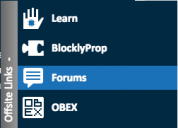
To help our customers find their way over here, Bump added a visual control to the Parallax web site that connects visitors to our five main web sites (Parallax, OBEX, Learn, BlocklyProp and Forums! On the right side you'll see an "offsite links" image:

When you click on it, it expands:

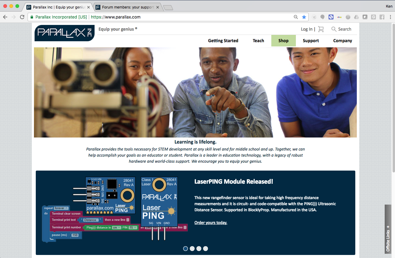
And, you'll also see a prominent Forum link under the Support button. This addition is probably easier to find than the pop-out menu. Together, these two features should drive more customers to the forums.
We are in the beginning of a serious mission right now to train 500 teachers. This kind of commitment has never been made by a company of our size. We are traveling to their locations, running the Professional Development, and giving them each an ActivityBot 360. This costs us several hundred dollars per teacher - and comes with a fairly well-known return to Parallax but not without significant risk.
Therefore, I ask for your support! I welcome your replies below, of all colors, shapes and sizes!
Thanks,
Ken Gracey
P.S. See the link to the Educator Hotline? We're getting a lot of inquiries this way right now (and I answer it with Kate and Matt, in case you ever want to call us)
Two points in this post: (1) Our focus on education includes you; and (2) Parallax forums have expanded support presence on parallax.com.
Parallax and our customers have long-standing roots in hobby, commercial and industrial uses. With the recent focus of Parallax on education and the launch of a new web site that focuses on these particular customers, you may feel overlooked as members of our team, customers, and tribe. I've read those thoughts a few times and you might feel we don't give the Propeller the attention it deserves. Some of you have felt that we quietly ignored Spin, in favor of C (which we used for Blockly).
We must continue to focus on a business segment we can effectively develop. What we do, we must do very well. But we can't do everything sorta well. You also know it's a changing marketplace. For example, free shipping on low-cost Chinese products plus many domestic outlets affect the hobby business. The Propeller is the core processor in our educational business and Propeller 2 will fit right in when it is finished. It takes educational customers to get this project achieved (Chip is in Colorado this week, supervising the layout progress). If we try to appear purely as a semiconductor company our educational customers will also not know how to communicate with us, so you see an obvious lean towards education.
We've reduced our support team to two people, but one of them (Miguel) is now traveling and running some of our courses with Matt.
Therefore we need your help. The support provided by these forums is exceptional and the reason we have many customers.
We are now increasing the visibility of the forums on our web site in an attempt to have more educational customers access your knowledge. I also hope that any of you who have felt neglected by the educational focus start to feel more included by Parallax.
To help our customers find their way over here, Bump added a visual control to the Parallax web site that connects visitors to our five main web sites (Parallax, OBEX, Learn, BlocklyProp and Forums! On the right side you'll see an "offsite links" image:

When you click on it, it expands:

And, you'll also see a prominent Forum link under the Support button. This addition is probably easier to find than the pop-out menu. Together, these two features should drive more customers to the forums.
We are in the beginning of a serious mission right now to train 500 teachers. This kind of commitment has never been made by a company of our size. We are traveling to their locations, running the Professional Development, and giving them each an ActivityBot 360. This costs us several hundred dollars per teacher - and comes with a fairly well-known return to Parallax but not without significant risk.
Therefore, I ask for your support! I welcome your replies below, of all colors, shapes and sizes!
Thanks,
Ken Gracey
P.S. See the link to the Educator Hotline? We're getting a lot of inquiries this way right now (and I answer it with Kate and Matt, in case you ever want to call us)


Comments
Parallax is really going out there to help educators. Nice to see!
For the Forums link, with the others, why call them "Offsite Links"? To me, this means a site other than Parallax, which is not what you are meaning. Perhaps there is better title for this? Even "More Info" would be more meaningful.
-Phil
What phrase do you think is most appropriate for that little expand-a-tab thing?
Parallax Sites
More Parallax
Parallax Resource Sites
Parallax Web Domains
Can you suggest something better? Help me help us
Ken Gracey
Also, it only opens or closes if you click the '+' or '-' character. Clicking anywhere on the gray box should toggle it.
Of course, the site overall looks much better than before.
It doesn't matter that much to me personally, because I go directly to the forums, and then get to the main site from the links at the top of the forums when needed.
When I open chrome, the forums are one of the tabs I have open by default.
I like "Parallax Sites" or "Other Parallax Sites"
Additional Resources
Sounds like more.
Sandy
While I respect Parallax and their educational endeavors, I have often wondered what is really being taught to these kids. Is it just electronics, robotics, and programming, or does it actually include creativity, the inventive process, problem solving, and what is really possible if these children examine real world problems seeking solutions with micro-controllers.
As an adult student, many things fascinate me, but real world applications and solutions have always caught my interest, as well as the ability to strike it rich with a brilliant idea, that can be achieved with a micro-controller (Propeller).
Patents will always exist... Mechanical engineering will always exist.. Electrical engineering will always exist. Perhaps teaching all three of these will lead to better sales.
-Phil
I rarely visit the Parallax main site as I go directly to the forum. But these "Resources" need a very visible click button. It's no help for others if it's not prominent.
Not all good looking websites are functional.
I may be a little biased but I love the education push, it's a great direction for Parallax to go. Ken and Parallax have my full support and anything I can do to further Parallax's agenda I will do.
Forum & Resources
It should not require effort to find the forum.
John Abshier
Ken Gracey
* Move it where it will actually be noticed! Seriously, for english-reading (left-to-right, top-to-bottom) people, the tab is in the absolute worst place to be noticed (look up the F-Pattern).
* Make the entire tab clickable, not just the "+" symbol.
* Change the label (everyone else already seems to be working on that one).
As for the menu option, you all really need to do something about the way that thing works. It is not immediately obvious that you will get a flyout menu. I instinctively clicked on the thing that looked like a link (just as the menu was starting to show) and ended up on the support page. But the support page is organized completely differently than the flyout menu is (and the Forum link is buried at the bottom). I realize this is more of a general usability issue, but trying to find the forum link made the issues painfully obvious. At the very least, consider turning off the anchor underline for the top-level menu.
There is an expectation now a days to see the most important things headlined on the home page.
"Products", "Store", "Forums", "Downloads" and such like.
Anyone visiting either wants to buy something, get some software to make the thing they bought work, or talk to someone about issues they are having.
I like "Support" as much as I would've liked "Resources." I'm a little confused by the apparent column headings and what comes under them, though. For example, why isn't "Propeller" listed under Microcontrollers? And why is "Authorized Consultants" listed under Forums? Also, why is Shop always highlighted, even when it hasn't been selected?
-Phil
Also, I really really hate web pages with faces of people. And I'm not alone. I consider it unprofessional, but typically pretend-professional.
[Edit] Or, more specifically: Propeller Object Exchange.
-Phil
Very annoying but what can you do?
I do wonder why all the tools one needs for Propeller development are not under "Downloads" where they should be.
And why the Propeller is not listed under "Microcontrollers" is totally unfathomable.
This is a serious case of hiding one's light under a bushel.
It is listed under "Microcontrollers" - not sure what you're looking at.
Ken Gracey
-Phil
It has a column headed "Microcontrollers". Under which is listed a bunch of BASIC Stamp things. No mention of the Propeller.
Actually, what I describe is in Phil's screenshot above.
I just had a look and I see that it is weird. I mean, the BOLD list headings are in themselves links but non-obvious. If there is going to be a list then everything under that heading should be in that list and a heading with a list should only be a heading, not a link.
In the old days links were in blue text and underlined so that you knew they were links. Or they looked like buttons you could press to make something happen.
Today there is no way to tell and you have to hover around and clicky on everything in the hope it might lead somewhere.
But, you know, web designers...