

A Dark Forums Skin
 Jen J.
Posts: 649
Jen J.
Posts: 649
Hello all,
As promised I am working on a darker version Forums skin. I have attached some screen shots for you to see. Work in progress, images and icons are as seen on our test site, so some of it may look odd. Let us know what you think.
Cheers, JJ
P.S. Please bear in mind the work is incomplete, and much is subject to change.
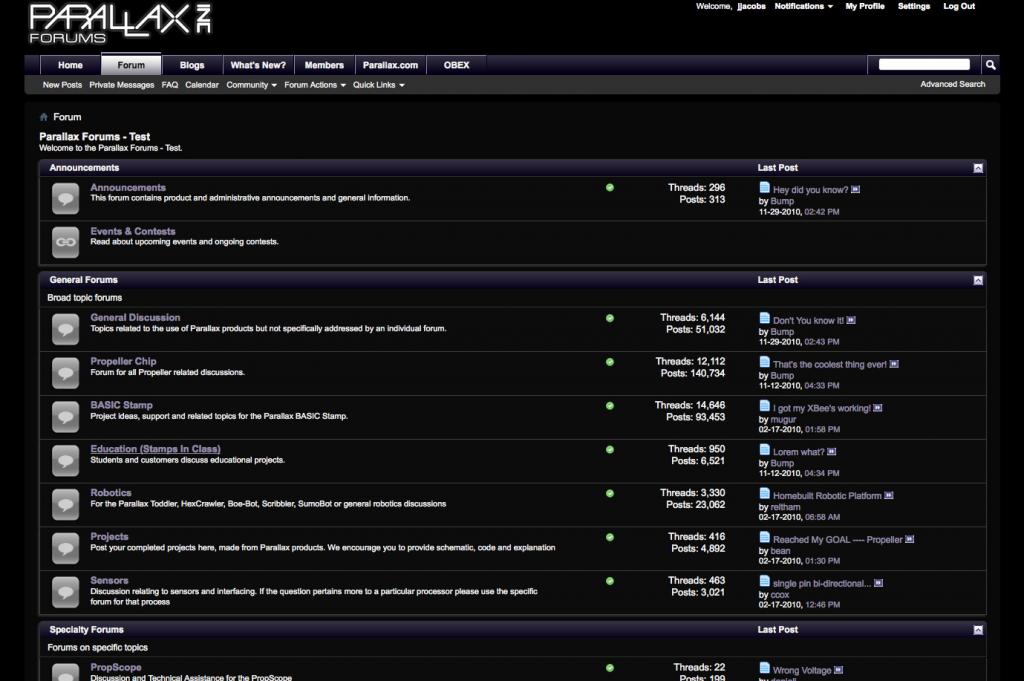


Comments
It is dark. I like it.
Ron
I do want a darker forum and I applaud Jen's efforts; just I _personally_ wouldn't want it quite so dark...
If it's overall - hate it...feels like I'm exploring a cave with one candle (yes, I've done that).
If it's adjustable - I'm looking forward to leaning the controls.
DJ
However that viewing style will not be customizable, it would be uber-dark, so if that's what you meant by overall then yes it is that dark.
I'm sure once we have a decent pitch black in place and if people are still clamoring for the inbetween then we'll look into a solution.
We went this dark initially because behind the scenes our conversation went like this:
B - "Do they mean black?"
JJ - "I could make it that dark."
KG - "No one wants it that dark."
B - "I don't know, maybe they do?"
JJ - "I'll make a black one and we'll see how they respond."
So now we're at the see how everyone responds phase
As for ratronic's skin, what would you call it? L.A. Rush Hour or Asian Industrial Air Quality Improvement Award?
Those would work, London Fog would also be appropriate.
Edit: Bump it's Christmas eve - Merry Christmas
So, I take it that enough people have complained about the white background to warrant the internal discussion you mentioned? I don't relish your position in the attempt to keep everyone happy. Cast my vote to leave as is. Will I quit the forum because it goes "uber-dark"? No - there's too much good informaton here. But it will be a bummer being back in the cave.
DJ
Oh, it will be an option. When more skins become available a drop-down menu will also appear in the lower left-hand corner of our discussion forums. From there you will be able to choose between the different skins. The default will always be this white colour.
Hope everyone had a lovely Christmas, now let's ramp it up for the New Year
Wonderful! I took your previous comments that the dark skin would be the only available skin. Glad to hear that there will be some options.
DJ
Cheers, JJ
-Phil
Ok. So how do I turn it on?
OBC
First of all, having a darker background would indeed conserve on my netbook's power consumption.
But Black is rather extreme.
In fact, the problems begin with where you want to go a grey scale of 1 to 10, but generally end up with which color you want and why.
I strongly recommend going for the middle grey, a 5 of the grey scale. Then trying to avoid too much color by deciding on a 'warm' or a 'cool' grey for the generall background.
Why so? I have serious trouble reading on a pure black background or even a dark blue or dark chocolate. And you have many more choices of font or icon color with a mid-range tone than with an extreme. At some point, you are going to have to handle color conflicts with all the little icons involved, and less conflicts to handle is a useful thing. As it now stands, you have a complete set of items that fit into a lighter background, but some of those outlined in black may not retain any sense of what they are on a near black background.
tha'ts my 2 cents. Good luck
-Phil
Am i missing something?
The new skins are still in development, so there is currently no way to change the colours
Just hoping for an update as to where this darker skin stands. Will we see it in the near future?
Thanks!
AJ
The dark skin should now be visible, I'll announce more on it in a bit when I'm done with the updates.
If you scroll down to the footer, bottom left-hand corner you will see a pulldown menu. Use that to toggle your skin on the fly.
Tell us what you think.
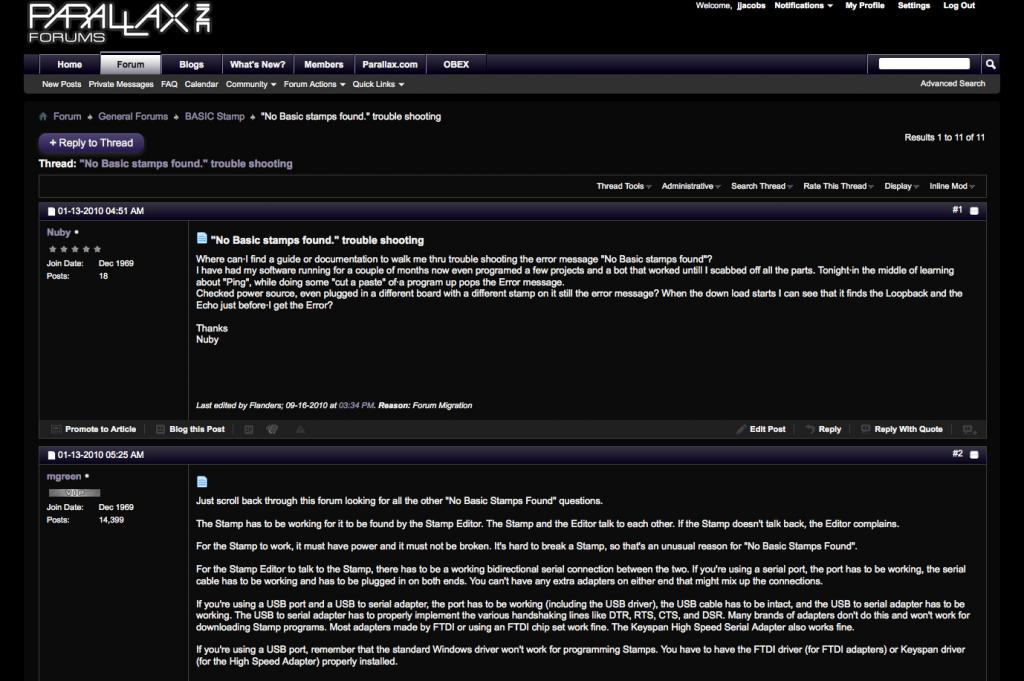
However the user names on the right side are hard to read.
Ah yes, I believe I know a solution for this. I'll see if I can make a quick fix to that style.
I see some other things that need my attention now.
1. The gradient on the two buttons at the bottom of a thread ("Forum name" and "Top") are a little extreme, and the bottoms of the buttons become invisible.
2. The dark background on the Advanced Editing page makes the editing/formatting icons above the edit field hard to read.
But the dark option is interesting... I have gotten used to the light version, even though in general I keep my desktop windows somewhat dark, so I'll try it some more.