

PropBASIC manual?
 SamMishal
Posts: 468
SamMishal
Posts: 468
Hi all,
I have been looking through the PropBASIC manual and I found it a PLEASURE to read, extremely well formatted and·utterly reader friendly. Congratulations to Terry and Jon on a superb manual and a brilliant PropBASIC. Keep up the excellent work!
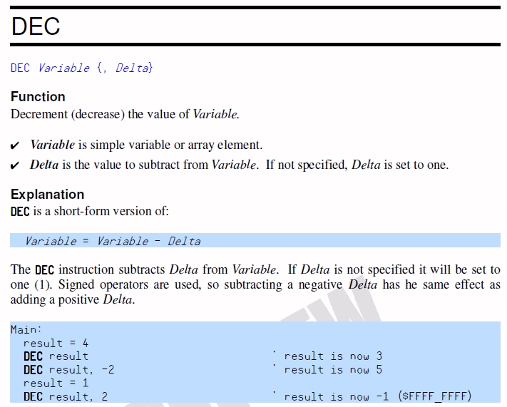
HOWEVER, I am quite intrigued as to what people think about a particular aspect of the manual. Please have a look below at the first attached image of a sample page from the PropBASIC manual and I beseech you to answer the following questions:
Did your eyes bleed while you are reading the manual?
@BradC…If you had to read a book that had changing font sizes, differently coloured and styled words on each page it'd make your eyes bleed.
Do you think yourself a Lazy person if you found the manual pleasing and easy to understand? And do you think that Terry and Jon are guilty of the offense of pandering to your laziness? Or did your head explode while your reading the manual and you found yourself unable to read it?
@BradC…That just comes across as pandering to the lazy, to the detriment of people who *do* want to read what you wrote, but end up not doing so because it makes their head explode.
Did you find the pages to be looking very messy?
@Heater….From a aesthetic point of view, paragraphs interrupted by excessive frills makes the page look very messy.
Do you think that Terry and Jon are lazy and deserve at most a D+ for their inability to·utilize the richness of the English language to convey their meaning instead of all that usage of Color, Different Font sizes, different font styles, bolding, highlighting?
@Heater….The English language is rich enough that it can convey any required emphasis with out any formatting tricks. I'm sure that my English teacher in school would have marked my home work down immediately if he saw my work was covered on upper case, large and coloured text. He would argue that the use of felt tip pens to highlight the meaning into the text indicates a failure to use the language correctly. As a minimum he would have put it down as being lazy.
Did your ears hurt in the process of perceiving the text as loud and intense and objectionably different? Did you think that Terry and Jon are regarding you as half blind and deaf because of their usage of different font sizes, colors, highlighting, italicizing and other formatting?
@Virand….I was wondering how and why Samuel's posts appear so different than everyone else's. They appear big and loud on my browser as if we are half blind and deaf. It reminds me of how I sometimes use bold and italic but Way More INTENSE.
Finally.....If you find (as I do) the manual’s style useful and pleasant, why would you object if the same is used in postings on this forum? Or is it only perhaps some people object while the majority do not? Or is it maybe that people are using limited browsers that render forum pages unreadable and thus the rest of us have to suffer bland uninspiring postings just so that we remain at the lowest common denominator level of browser abilities?
I am REALLY concerned since this has been made into quite an issue in another posting and I am quite miffed about it. I am only trying to be helpful and offer my humble expertise to assist people with their inquiries in gratitude for the support I received and remain to receive when I need it.·It is a case of do unto others as you would unto yourself. A maxim that if all humanity used we would all exist in harmony and peace would reign supreme. Alas this will never be, since it is an unstable system. It would only take a minor perturbation to bring the whole system cascading down to the actual state of the world.
I sorely need your feedback on this (with a PM if you prefer). I am quite bothered about this whole issue and I am really interested to know what the majority opinion is.
Maybe it is again a proof of "No good deed goes unpunished" phenomenon that makes me think that humanity is a depressingly meaningless accident. But on the other hand I see many of the people in this forum and at Parallax and I am inclined to reject that.
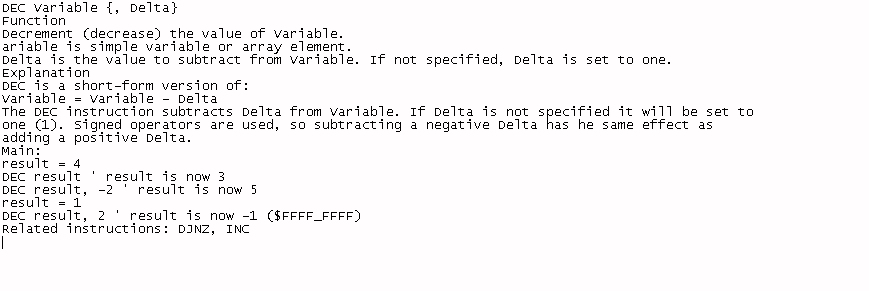
The second image below shows what the page would look like in the good old days of VI and ED and Man of Unix….is that really what the people of this forum want to see?
·
▔▔▔▔▔▔▔▔▔▔▔▔▔▔▔▔▔▔▔▔▔▔▔▔
Samuel
www.RobotBASIC.com
Post Edited (SamMishal) : 1/22/2010 2:33:23 PM GMT
I have been looking through the PropBASIC manual and I found it a PLEASURE to read, extremely well formatted and·utterly reader friendly. Congratulations to Terry and Jon on a superb manual and a brilliant PropBASIC. Keep up the excellent work!
HOWEVER, I am quite intrigued as to what people think about a particular aspect of the manual. Please have a look below at the first attached image of a sample page from the PropBASIC manual and I beseech you to answer the following questions:
Did your eyes bleed while you are reading the manual?
@BradC…If you had to read a book that had changing font sizes, differently coloured and styled words on each page it'd make your eyes bleed.
Do you think yourself a Lazy person if you found the manual pleasing and easy to understand? And do you think that Terry and Jon are guilty of the offense of pandering to your laziness? Or did your head explode while your reading the manual and you found yourself unable to read it?
@BradC…That just comes across as pandering to the lazy, to the detriment of people who *do* want to read what you wrote, but end up not doing so because it makes their head explode.
Did you find the pages to be looking very messy?
@Heater….From a aesthetic point of view, paragraphs interrupted by excessive frills makes the page look very messy.
Do you think that Terry and Jon are lazy and deserve at most a D+ for their inability to·utilize the richness of the English language to convey their meaning instead of all that usage of Color, Different Font sizes, different font styles, bolding, highlighting?
@Heater….The English language is rich enough that it can convey any required emphasis with out any formatting tricks. I'm sure that my English teacher in school would have marked my home work down immediately if he saw my work was covered on upper case, large and coloured text. He would argue that the use of felt tip pens to highlight the meaning into the text indicates a failure to use the language correctly. As a minimum he would have put it down as being lazy.
Did your ears hurt in the process of perceiving the text as loud and intense and objectionably different? Did you think that Terry and Jon are regarding you as half blind and deaf because of their usage of different font sizes, colors, highlighting, italicizing and other formatting?
@Virand….I was wondering how and why Samuel's posts appear so different than everyone else's. They appear big and loud on my browser as if we are half blind and deaf. It reminds me of how I sometimes use bold and italic but Way More INTENSE.
Finally.....If you find (as I do) the manual’s style useful and pleasant, why would you object if the same is used in postings on this forum? Or is it only perhaps some people object while the majority do not? Or is it maybe that people are using limited browsers that render forum pages unreadable and thus the rest of us have to suffer bland uninspiring postings just so that we remain at the lowest common denominator level of browser abilities?
I am REALLY concerned since this has been made into quite an issue in another posting and I am quite miffed about it. I am only trying to be helpful and offer my humble expertise to assist people with their inquiries in gratitude for the support I received and remain to receive when I need it.·It is a case of do unto others as you would unto yourself. A maxim that if all humanity used we would all exist in harmony and peace would reign supreme. Alas this will never be, since it is an unstable system. It would only take a minor perturbation to bring the whole system cascading down to the actual state of the world.
I sorely need your feedback on this (with a PM if you prefer). I am quite bothered about this whole issue and I am really interested to know what the majority opinion is.
Maybe it is again a proof of "No good deed goes unpunished" phenomenon that makes me think that humanity is a depressingly meaningless accident. But on the other hand I see many of the people in this forum and at Parallax and I am inclined to reject that.
The second image below shows what the page would look like in the good old days of VI and ED and Man of Unix….is that really what the people of this forum want to see?
·
▔▔▔▔▔▔▔▔▔▔▔▔▔▔▔▔▔▔▔▔▔▔▔▔
Samuel
www.RobotBASIC.com
Post Edited (SamMishal) : 1/22/2010 2:33:23 PM GMT
711 x 571 - 162K
869 x 291 - 100K
Comments
I skip most of your responses because to me they are unreadable,·so please take the hint.
Just my 2 cents.
▔▔▔▔▔▔▔▔▔▔▔▔▔▔▔▔▔▔▔▔▔▔▔▔
Links to other interesting threads:
· Home of the MultiBladeProps: TriBlade,·RamBlade,·SixBlade, website
· Single Board Computer:·3 Propeller ICs·and a·TriBladeProp board (ZiCog Z80 Emulator)
· Prop Tools under Development or Completed (Index)
· Emulators: CPUs Z80 etc; Micros Altair etc;· Terminals·VT100 etc; (Index) ZiCog (Z80) , MoCog (6809)
· Search the Propeller forums·(uses advanced Google search)
My cruising website is: ·www.bluemagic.biz·· MultiBladeProp is: www.bluemagic.biz/cluso.htm
Post Edited (Cluso99) : 1/22/2010 2:35:16 PM GMT
I must admit I'm a bit lost as to the point of your post ??? It just seems to be rambling about what others have said about some of your previous posts.
Are you saying the manual is good or bad ???
Are you saying the manual uses different fonts and styles so people shouldn't say anything about you doing the same in your posts ?
You seem to be responding to people who have not even posted anything in this thread. It really doesn't make any sense out of context.
Bean.
▔▔▔▔▔▔▔▔▔▔▔▔▔▔▔▔▔▔▔▔▔▔▔▔
- - - - - - - - - - - - - - - - - - - - - - - - - - - - - - -
Use BASIC on the Propeller with the speed of assembly language.
PropBASIC thread http://forums.parallax.com/showthread.php?p=867134·
In my opinion, that PROPBASIC manual is excellent, well accomplished, easy to read, well designed, enjoyable, informative, easy to download, easy on the eyes, logical, has excellent layout and content, and overall is an incredibly valuable piece of work.
The team of men that developed the PROPBASIC manual are well informed and have genius talent that goes far beyond what we come to expect in manual development. The fonts are brilliant and clear, and the presentation is amply illustrated. After all, they have something truly wonderful to work with - PROPBASIC!
Of course, if anyone has the time, creating more pleasing posts with some logical variations in layout is welcome. You already have my POSITIVE comments on PROPBASIC.
humanoido
▔▔▔▔▔▔▔▔▔▔▔▔▔▔▔▔▔▔▔▔▔▔▔▔
Jon McPhalen
Hollywood, CA
I've made comments here, that on reflection probably should not have voiced, for certain have upset many of the people here. For me at least is merely A hobby, I can take it or leave it. I certainly think the PropBasic manual documentation and whole project to be very professional and A much needed addition for the Propeller Chip.
Really let's keep everyone on board and just totally positive, the world is so full of problems at this time this need not be that place.
Mike.
Over the years I have published things and found that Graphic Art and the art of publishing are entire specialties in themselves. I can't draw. I am not very good at publishing. People I went to school with who got good marks in art have gone on to have very successful careers in graphic design. I'm no expert in this at all, but what I have noticed over the years is that if you copy, 100%, the graphic components of a good looking book or manual, you too can publish something that looks good.
For example, I noticed that some font combinations are used together a lot. Eg Times Roman unbold for the main text, Times Roman Bold for an abstract, and Arial Bold 12 points for paragraph and chapter headings.
Stick to this recipe and things look good. Indeed, look at the PropBasic manual and it uses something similar.
The difference lies in using bold and italics and color consistently, eg you might use italics to quote people, or whenever you write a word in another language, or when writing all assembly instructions. You might use bold for all Spin instructions. You might use color for all comments, like in .NET, and a different color for programming text that is in quotes.
But once you set down those rules in your own mind, you then must stick to them 100% all through that document. Then the reader quickly gets to know what those rules are, and can scan through documents more quickly looking for the parts that interest them.
I think that is why the PropBasic manual looks so good.
I'd write more, but I'm like a pig in mud using the above mentioned manual to write some code!
▔▔▔▔▔▔▔▔▔▔▔▔▔▔▔▔▔▔▔▔▔▔▔▔
www.smarthome.viviti.com/propeller
I have only skimmed through the PropBASIC Syntax Guide but I can see almost immediately that it is very professionally presented. Yes, it makes liberal use of different fonts, and bold, and colour and all those things that I put down as poor writing style in another context.
So what's the difference? Why is all that embellishment acceptable and desirable in that manual but not in other forms of writing?
I think you know the answer. Writing a technical reference like that is something of an art form. It has to be easy to look things up, hence the excessive number of Sections, sub-sections and headings and different styles and colours.
When describing a computer programming language we have an even harder problem to solve. That is making it obvious to the reader which fragments of text are normal descriptive prose, which fragments are the language keywords, which fragments are example code in the language under discussion, which fragments are a "meta" language describing the language under discussion, like BNF for example. Etc. Etc.
Fonts, text size, colour etc are a very good way to make the necessary distinctions. The key here is having a plan, and consistently sticking to it. Notice that these kinds of documents generally introduce the plan to the reader early on with a section "Conventions Used in this Document".
So top marks to Hitt Consulting for the use of style in the manual.
What do we learn here?
All those stylistic tricks, when used well and consistently, for good reason, by a skilled communicator are a joy to behold. When used seemingly at random for no apparently useful purpose those same tricks only distract the reader, and bury any underlying meaning in "noise".
Now, would you really prepare a letter of application for a prospective employer that looked like the first post to this thread?
▔▔▔▔▔▔▔▔▔▔▔▔▔▔▔▔▔▔▔▔▔▔▔▔
For me, the past is not over yet.
▔▔▔▔▔▔▔▔▔▔▔▔▔▔▔▔▔▔▔▔▔▔▔▔
Jon McPhalen
Hollywood, CA
As I said, I only skimmed the document but straight away it looked very professional. Yes, it does follow the excepted norms for such a document. The message is clear "These guys know what they are doing"
As much as engineers hate to admit it, presentation is very important.
▔▔▔▔▔▔▔▔▔▔▔▔▔▔▔▔▔▔▔▔▔▔▔▔
For me, the past is not over yet.
But most of all, thank you very much for working on this project and sharing it with us.
▔▔▔▔▔▔▔▔▔▔▔▔▔▔▔▔▔▔▔▔▔▔▔▔
Style and grace : Nil point
humanoido
humanoido
Post Edited (humanoido) : 1/26/2010 12:13:52 PM GMT
▔▔▔▔▔▔▔▔▔▔▔▔▔▔▔▔▔▔▔▔▔▔▔▔
Jon McPhalen
Hollywood, CA
PropBasic Manual ???· I have done tons of searches and
can't seem to find it anywhere ?
>PropBasic Manual ??? I have done tons of searches and
>can't seem to find it anywhere ?
I found the manual here http://forums.parallax.com/showthread.php?p=867134 at the bottom of the first post there are three files for download. Hope this helps.
▔▔▔▔▔▔▔▔▔▔▔▔▔▔▔▔▔▔▔▔▔▔▔▔
www.smarthome.viviti.com/propeller