

Software UI - Graphical design
 Erik Friesen
Posts: 1,071
Erik Friesen
Posts: 1,071
Just curious about opinions and references to this subject.
I have been going over some of the principles outlined in the book by stephen few - Information Dashboard Design. One of his ideas are that pretty graphics quickly become old in normal use. So I guess this type of graphing for example, wouldn't really pass - www.telerik.com/products/winforms/chart.aspx
I am trying to find a balance between functional blah and a nice looking screen.
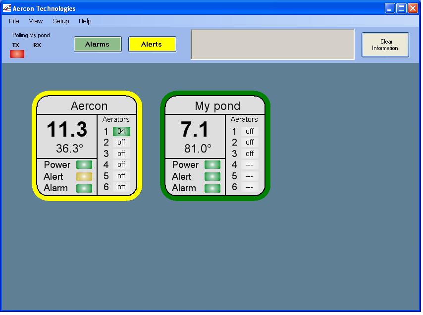
My application involves monitoring fish in multiple ponds. I have attached the home screen view for reference.
I have been going over some of the principles outlined in the book by stephen few - Information Dashboard Design. One of his ideas are that pretty graphics quickly become old in normal use. So I guess this type of graphing for example, wouldn't really pass - www.telerik.com/products/winforms/chart.aspx
I am trying to find a balance between functional blah and a nice looking screen.
My application involves monitoring fish in multiple ponds. I have attached the home screen view for reference.
854 x 636 - 53K
Comments
-Phil
I have been challenged by Edward Tufte's reasoning. I have three of his books:
- The Visual Display of Quantitative Information
- Envisioning Information
- Visual Explanations: Images and Quantities, Evidence and Narrative
While I do not agree with his every thought, I have noticed that my sense of aesthetics has been rationalised and temporised (both verbs in the positive sense) after being subjected to his ideas. I have Visual Display on the exercise bike's reading tray right now. See links en.wikipedia.org/wiki/Edward_Tufte and www.edwardtufte.com/tufte/.Sometimes lost in the hyperbole surrounding the Seven, Plus or Minus Two mantra are the meaningful ramifications of the same. For background, see en.wikipedia.org/wiki/The_Magical_Number_Seven,_Plus_or_Minus_Two; and for a 'contrarian' viewpoint see The Myth of 'Seven, Plus or Minus 2' at www.ddj.com/184412300.
You might find Niall Murphy's Usability articles to be thought-provoking. Find them at www.panelsoft.com/murphyslaw/.
There are other opinions, too.
Daniel
@Phil. The reason for my question has to do with some of the feedback I get from the handful of users and observers so far, and some of the things I have run into are embodied in the above article. One thing that comes to my mind would be gradient backgrounds. I am sure that if I showed the head guys what all could happen with gradients and 3d looks that they would probably like it, but that would bring its own set of layout problems, and I am not sure in the end that that would be appreciated anyway.
I also feel like I am designing some of my interface on instinct, and I need a more structured approach. While form should be second, I still want the user to feel that the program wasn't just thrown together, and that the overall look is professional. The software targets a relatively small group, and the price will be somewhat hefty, although not out of range with other software of a similar class.
Is it easy to change the text as well as the colour? I frequently have operators asking me if a green alarm light means it's on. {Green means on for the motors/pumps so does green mean on for alarms?).
Of course it means that in {some perdominatley water} plants I get confused as RED means on {red = danger, a pump running is dangerous, but at least a RED alarm means a dangerous condition}.
My solution to things that _might_ be confusing is to also change the text.
So I might have a string that says "System OK" with a green box beside it, but then change that text to say "ALARM" {with a yellow box - cause all I've {tried to} standardise on yellow for all 'something is wrong here"}
▔▔▔▔▔▔▔▔▔▔▔▔▔▔▔▔▔▔▔▔▔▔▔▔
=================
The future is in our hands.
Which way to the future?
=================
Some literature recommends avoiding color as a primary means of communication.
My suggestion on text was related to the Alert/Alarm words on the Aercon unit. My thoughts were 'Alarm' might have been better worded as "'System OK" and "Alert" as "Alerts Active". They were only suggestions, your solution seems _perfectly_ elegant for what you describe.
I would also like to see some units (use Si abbreviations) for the numbers. I though the 11.3 was probably pH, bit it actually amps (A). And the degrees under it, are they in Celsius, Fahrenheit, Kelvin, angular offset?
The drill down for more info gets my 'tick of approval'
I agree that colour as a the _only_ means of communication should be avoided, but I've found that colour is the easiest for the casual observer (glance at the main SCADA screen and if any belt is not green then there is a problem). Text/different symbols can be more difficult to decipher from more than a few feet away.
Each system is different and each system needs it's own 'rules'. The biggest hint I can offer is 'be consistent' {not that I'm suggesting you aren't}. I've worked on a system where for some reason known only to the designers, the east and west 'sides' of the plant swapped dependant on which screen you were on this same system, depending if a field unit was passive (a sensor) or active (a motor) different colours meant different things, On another there were the 15 different colour combinations (red, with a white edge and a blue hand in the top left corner , vs red with a blue edge and a green hand in the bottom right, etc, etc}.
Don't get too hung up though, humans are very adaptable and _will_ become comfortable with particular system pretty quickly.
Your obviously giving it some thought and are concerned enough to try and implement best practice. That fact alone speaks volumes {in a positive way}.
But be careful of trying to please everyone - 5 people will have 8 different ways of displaying the same information. All of them are right...Choose one
Just PLEASE be consistent...
▔▔▔▔▔▔▔▔▔▔▔▔▔▔▔▔▔▔▔▔▔▔▔▔
=================
The future is in our hands.
Which way to the future?
=================
Post Edited (pacman) : 12/29/2009 9:30:51 PM GMT