

PST Font problem?... A work around for drawing a grid
 R Baggett
Posts: 269
R Baggett
Posts: 269
Hi,
I tried to get fancy and draw a grid with my Calibration routine. I set this string to be printed using Parallax Serial Terminal.
DAT
Menu    byte pst#CS,"                           4 channel calibration for 14 bits",13
        byte "                  State",13
        byte "       (G)nd hard",13
        byte "       (P)wr Hard",13
        byte "      (D)ischarge",13
        byte "        (U)ut Pwr",13
        byte "     Short J(O)ne",13
        byte "     Short J(T)wo",13
        byte "  Short J T(H)ree",13
        byte "    Short J(F)our",13
        byte 13
        byte "       RawHi       RawLo       CalHi       CalLo       Raw         Scaled",13
        byte "      ┌───────────┬───────────┬───────────┬───────────┬───────────┬────────────┐",13
        byte "TPI(0)│           │           │           │           │           │            │",13
        byte "      ├───────────┼───────────┼───────────┼───────────┼───────────┼────────────┤",13
        byte "TPI(1)│           │           │           │           │           │            │",13
        byte "      ├───────────┼───────────┼───────────┼───────────┼───────────┼────────────┤",13
        byte "TPI(2)│           │           │           │           │           │            │",13
        byte "      ├───────────┼───────────┼───────────┼───────────┼───────────┼────────────┤",13
        byte "TPI(3)│           │           │           │           │           │            │",13
        byte "      ├───────────┼───────────┼───────────┼───────────┼───────────┼────────────┤",13
        byte " TP(C)│           │           │           │           │           │            │",13
        byte "      ├───────────┼───────────┼───────────┼───────────┼───────────┼────────────┤",13
        byte "TP(A)G│           │           │           │           │           │            │",13
        byte "      └───────────┴───────────┴───────────┴───────────┴───────────┴────────────┘",13
        byte "(M)y number:",0
stops   byte         7,          19,         31,         43,         55,         67
rows    byte 14,16,18,20,22,24
StStop  byte 20
StRows  byte 3,4,5,6,7,8,9,10
But then it is displayed in PST like this: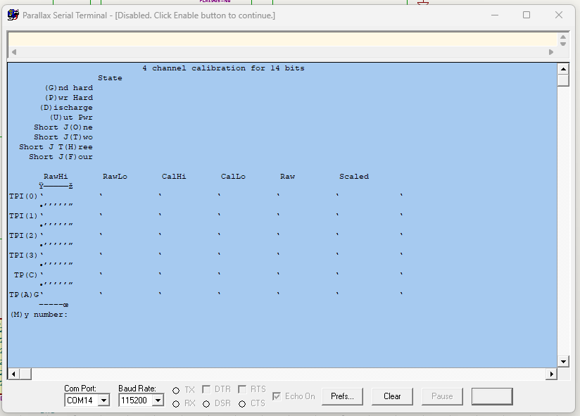
I don't see a way to ensure PST is using the Propeller font.
The font is installed and working.. The DAT section above displays properly in Propeller Tool and in notepad when Parallax font is selected.
What am I doing wrong?
Comments
I think PST is locked to Courier -- seems odd, but there is no place in it to select the font, and even a search of its registry entry came up blank vis-à-vis the PST font.
I was afraid of something like that.. I will give it a try to draw the grid some other way.. or just go back to my old one..
Thanks!
It ain't as purdy.. but it works. This makes a more readable grid than my old one. It's not as nice as it could have been.
On the upside, it will probably work with most monospaced fonts:
DAT Menu byte pst#CS," 4 channel calibration for 14 bits",13 byte " State",13 byte " (G)nd hard",13 byte " (P)wr Hard",13 byte " (D)ischarge",13 byte " (U)ut Pwr",13 byte " Short J(O)ne",13 byte " Short J(T)wo",13 byte " Short J T(H)ree",13 byte " Short J(F)our",13 byte 13 byte " RawHi RawLo CalHi CalLo Raw Scaled",13 byte " |-----------|-----------|-----------|-----------|-----------|-----------|",13 byte "TPI(0)| | | | | | |",13 byte " |-----------|-----------|-----------|-----------|-----------|-----------|",13 byte "TPI(1)| | | | | | |",13 byte " |-----------|-----------|-----------|-----------|-----------|-----------|",13 byte "TPI(2)| | | | | | |",13 byte " |-----------|-----------|-----------|-----------|-----------|-----------|",13 byte "TPI(3)| | | | | | |",13 byte " |-----------|-----------|-----------|-----------|-----------|-----------|",13 byte " TP(C)| | | | | | |",13 byte " |-----------|-----------|-----------|-----------|-----------|-----------|",13 byte "TP(A)G| | | | | | |",13 byte " |-----------|-----------|-----------|-----------|-----------|-----------|",13 byte "(M)y number:",0 stops byte 7, 19, 31, 43, 55, 67 rows byte 14,16,18,20,22,24 StStop byte 20 StRows byte 3,4,5,6,7,8,9,10I'm fussy about displays, too. When I need a grid I tend to put a + in the corners and intersections.
Cool! modifying now..