Fascinating! Two secret Internal Rom Fonts!
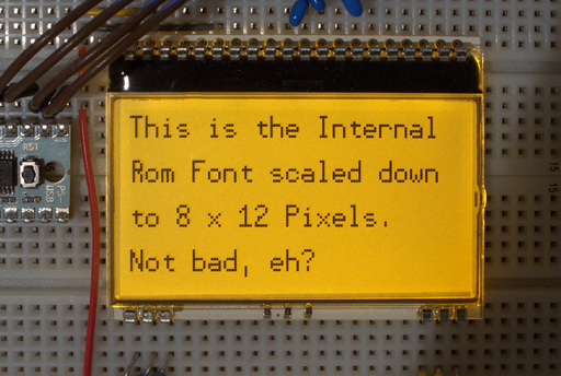
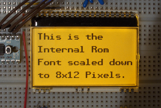
While playing with my Dogm-LCD-Display and the driver DeSilva made for it, I managed to find a cool way to scale down the internal rom font to a reasonable size.
This could also be interesting for other·people who need smaller fonts·and need to save memory -·and maybe even for Parallax. (the Font for Prop2 could probably be further optimized for good scalability...) - so I thought I'll share·this in an extra-thread not in the dogm-workshop.
Scaling down the rom-font is no big deal you may say, just skip every other line and column or use every third. But if you just do that,·the font·doesn't look very readable.
I found out that it looks best if you use lines 1,4,6,9,11,14,17,20,22,25,27,28,31
Don't ask me why, I just tried it out until it looked best.
With the columns it's slightly more complicated: if you take every third column, starting from the second column you get a nice·6 x 12 pixel font, if you take every·other column starting from the second column you get a beautiful bold 8x12 font. - Except some characters that have to be treated differently:
With the normal font characters "kKf*.R€▶◀>:;,t" should start from the third column and for the bold font characters "14IilYZ7VT" should start from the first column.
I know this sounds confusing, but it can all be done in a few lines of spin and really saves a lot of memory if you need it.
I also know, it would have been nicer if I could have·demonstrated this with the TV_text object, so you could all see the font on TV-screen,·but implementing it there is far beyond my skills, I'm afraid...


....well here goes another thread that I'm really not sure it's a good idea to start it... I hope someone shares my fascination about this... ;-)
Attached are the spin-files based on deSilva's driver for the dogm-display.
This could also be interesting for other·people who need smaller fonts·and need to save memory -·and maybe even for Parallax. (the Font for Prop2 could probably be further optimized for good scalability...) - so I thought I'll share·this in an extra-thread not in the dogm-workshop.
Scaling down the rom-font is no big deal you may say, just skip every other line and column or use every third. But if you just do that,·the font·doesn't look very readable.
I found out that it looks best if you use lines 1,4,6,9,11,14,17,20,22,25,27,28,31
Don't ask me why, I just tried it out until it looked best.
With the columns it's slightly more complicated: if you take every third column, starting from the second column you get a nice·6 x 12 pixel font, if you take every·other column starting from the second column you get a beautiful bold 8x12 font. - Except some characters that have to be treated differently:
With the normal font characters "kKf*.R€▶◀>:;,t" should start from the third column and for the bold font characters "14IilYZ7VT" should start from the first column.
I know this sounds confusing, but it can all be done in a few lines of spin and really saves a lot of memory if you need it.
I also know, it would have been nicer if I could have·demonstrated this with the TV_text object, so you could all see the font on TV-screen,·but implementing it there is far beyond my skills, I'm afraid...


....well here goes another thread that I'm really not sure it's a good idea to start it... I hope someone shares my fascination about this... ;-)
Attached are the spin-files based on deSilva's driver for the dogm-display.


Comments
Nice job. I too tried using every other row/column and like you say "it don't look good".
Bean.
▔▔▔▔▔▔▔▔▔▔▔▔▔▔▔▔▔▔▔▔▔▔▔▔
- - - - - - - - - - - - - - - - - - - - - - - - - - - - - - -
www.iElectronicDesigns.com
·
Very nice, indeed!
With TV output, since there are several gray levels available, it might be interesting to see what can be accomplished at lower resolutions with anti-aliasing. For example, by examining a 2x2 "super pixel" in the original font and counting the bright pixels within, one could assign it an intermedtiate intensity level. This might result in something that's still readable and pleasing to the eye ... or it could end up looking like total mush.
-Phil
The problem with using this font is that the standard TV driver trickyly uses 4-colour mode, which in turn was the reason to interleave the characters in ROM in the first place.
Clemenses glyphs however can be used as "pix" with (modified) GRAPHICS
Using them with a tiled driver will need special modifications inside TV or VGA.
Edit:
Not that using those fonts with the DOGM display is easy. Obviously you could have 5 lines on it rather than 4. But as its internal addressing is arranged around 8 pixel lines it is extreme awkward to put 2 logical lines into 3 physical.
It might be best to simulate a full bitmap memory, swapping to the display. As it is B/W only this will not take so much memory (1 kByte). This need not even bind a COG as it can be done "on demand" from the main COG.
Post Edited (deSilva) : 2/14/2008 12:08:12 AM GMT
@Clemens: Was ich noch sagen wollte: Eine geniale Leistung, das ausget
····0 pixels => black
····1 pixel => dk gray
····2 pixels => med gray
····3,4 pixels => white
My gut tells me, though, that effective anti-aliasing is more complicated than just counting dots in each super pixel. The states of neighboring pixels might have to be considered, too. At some point, the computational burden will become too great to accomplish between WAITVIDs or during horizontal blanking.
-Phil
Sorry for the slight thread hijack
With bitmap drivers you have no problem at all. The simplest down-sampling is just integrating the collapsed pixels. There are more complex filters, of course. This is an offline process
With tiled drivers it will become extremely more tricky. I share your concern that there will be not enough time for the needed processing.
But first things first: a PC simulation would be the easiest way to tell if this line of thought is even worth pursuing. Who knows? An anti-aliased Propeller font might look like total Smile.
_______________________
Of course, none of this is meant to diminish Clemens' superb results; and I fear that my idle conjecture has caused his thread to be hijacked. In point of fact, his discovery of how to sample and downsize the Propeller font in two-color mode is quite striking, very possibly mooting any reasons for anti-aliasing to begin with. I suggest we give him his thread back and take up any further discussion under a new heading.
-Phil
Clemens choose the title of this thread quite general, as he sure is aware of this significance far beyond using it in his (and my) little "toy".
To apply it to TV there are two steps:
(1) calculate whether it is possible to down-sample the characters "on the fly". (Which comes close to TRYING it). This will no longer be compatible with a general bitmap mode of the driver. There could be advantages for using 2-color mode for this!
(2) By using the power of 4-color mode (which is NOT utilized at the moment other than sorting out the character interleave) a smoothed grayscaled (it will work for any hue BTW) presentation is possible.
(3) As I doupt the feasibility in the available timeslot, a precomputed font can be dynamically constructed (WRT (1) or (2)) This will take 256*9 bytes for the 6x12 monochrome font by Clemens , and 256*32 bytes for an 8x16 antialised font by Phil. Incompatible changes in TV are still needed for both cases!
Post Edited (deSilva) : 2/14/2008 9:24:20 AM GMT
I like my threads being hijacked, no problem there!
And besides thoughts on an antialiased font is not so OT in this thread.
I·was actually·trying to get greyscales for antialiasing on the little display by PWMing some pixels, but the refresh rate for the whole screen is not fast enough of course.
@ deSilva: Yes something like a screen buffer would be very nice also for getting button-type borders around words to make a good looking touch screen interface (which is my long-term intention) and for graphic display in general.
But I'm doing this step by step and I'm glad the driver is so comprehendable for me right now. - Which doesn't mean I wouldn't appreciate further enhancements of the driver ... ;-)
You seem to be involved in quite a lot of projects right now, so no problem if you don't have a "free cog" for this one right now. LOL.
Danke für's Kompliment.
Clemens
Post Edited (Clemens) : 2/14/2008 3:08:52 PM GMT
Post Edited (stevenmess2004) : 2/14/2008 10:41:47 AM GMT
Attached is an image containing several downsampled (half-scale) renderings of the Propeller font using various strategies. The TV output is capable of six gray levels, ranging from 0 (black) to 5 (white). Each block of four pixels in the original dark-on-light font can have a count ranging from 0 (all dark pixels) to 4 (all light pixels). Each strategy is identified by a series of integers (e.g. 5 5 0 0 0). This series represents a mapping from the pixel count in each block to an intensity level. So "5 5 0 0 0" means, "If the block contained 0 or 1 light pixels ( i.e. 3 or 4 dark pixels), assign a brightness level of 5 (white); otherwise, assign 0 (black)." All the renderings invert the font thus from dark-on-light to light-on-dark.
I'll leave it for the readers to judge which looks best.
-Phil
Using the luma value is cute, as the chroma can stay as given by the tiling; this is the abvantage when working directly in the driver. (but never use sync level 0! It should be 1 to 5, not 0 to 5)
The "Gretchen question" as we call it German: How long does it take to add the luma values and to extract the bits???
The six luma values I cited do not include the sync value (-2 on my scale) or "blacker than black" (-1 on my scale). Also I'm not sure what you mean by, "... the chroma can stay as given by the tiling ...". The grayscale values are just eight-bit color specs that happen to have their chroma bit set to zero. There's nothing otherwise special about them, and they can intermingle freely with chroma-modulated colors in the same tile.
As to the Gretchen question: I haven't got a clue!
-Phil
Post Edited (Phil Pilgrim (PhiPi)) : 2/15/2008 9:18:58 PM GMT
-Phil
Addendum: The attached image is rendered by using the font's full resolution horizontally and sampling vertically by ORing adjacent lines together.
Post Edited (Phil Pilgrim (PhiPi)) : 2/15/2008 9:47:10 PM GMT
But it's not half scale, is it? I'm counting 24*12 pixels, which is 3/4 of the original 32*16.
Or am I getting something wrong?
But note there is a strict 4 color model in GRAPHICS. When needing "shades" (B,ltG, dkG,W) then thta's it for the whole screen, more or less. Looks like a case for a very special application, as TV_TYPEWRITER....
I now have my doubts that this method could be as easily implemented as I thought. The TV.spin driver, upon which TV_text.spin depends, will not run at the necessary pixel rate. So modifying it to produce characters on the fly seesm less feasible now. That leaves the graphics driver approach. 30-50 longs? Hmm.
-Phil
You bring up a good point. No analog TVs — nor even most black-and-white monnitors — have the necessary horizontal frequency response to handle an 80-character line of text. And with a color monitor, the fine detail would cause color fringing, even without chroma modulation. This windmill may not be worth tilting at, after all.
-Phil
Sorry for disturbing your but I have a little bit to add to the topic subject.
1-st of all, the Parallax font is looking really nice!
The only problem was to obtain parallax-derived fonts (with sizes of 08x16, 12x24 etc.).
My dream was to obtain a set of raster Parallax fonts to be able to show attactive messages on a different OLED I2C/SPI displays.
After the web diving I recognized that a) I'm not alone and b) there is no parallax-derived fonts publicly available.
Well, I have spent several hours being importing varying sizes of Parallax ttf-font and rasterizing it by available means.
One of these is TheDotFactory (http://http://www.eran.io/the-dot-factory-an-lcd-font-and-image-generator/).
Good program with a lot of options! But I couldn't realize how to declare MY requirements BEFORE the program handles a font.
(for example, I would like to declare how the data in "*.c" is generated - as bytes, as words or as unsigned longs, but there is now such an option there).
etc., etc., etc...
Nevertheless, I could not find neither a set of variable-sized rasterized parallax-like fonts nor could I found a free-of-charge tools to make the job easy.
Okay, I have done it!
Now I have beatiful 08x16 raster font and about ideal 12x24 parallax-based raster font.
I did spent a part of my soul in both of it and now I'd like to share with you the result.
No special format is used - the fonts are in plain text format.
Anybody is free to have it's own parser to make it's code to convert the fonts to an appropriate layout.
Please see the files attached and be free to get in touch with me in case of any questions.
http://www.rayslogic.com/Software/RaysFontEditor/RaysFontEditor.htm
You might find it useful...